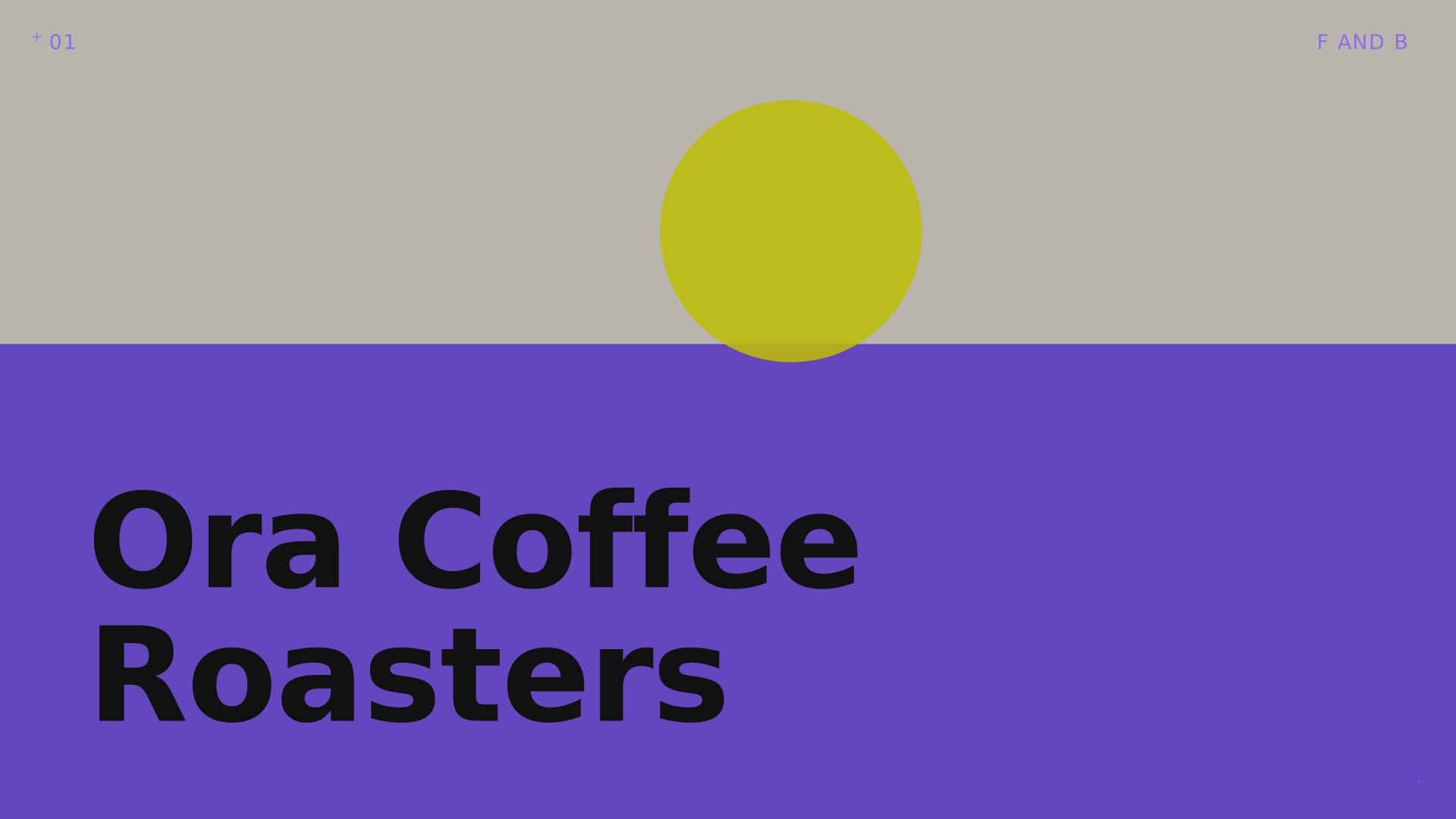
Ora roasts small-batch coffee across three city kiosks. They needed one identity that could travel between a paper cup, a delivery box and a feed.
Each location had its own signage, its own bag, its own tone of voice — the brand looked like three different cafés wearing the same name.
Build a system around a single mark — a sun-split circle — that adapts its crop and colour by daypart and product line, so the identity stays recognisable while feeling alive.
A modular identity system covering packaging, cup sleeves, kiosk signage and a content rhythm for social — shot in-house with a consistent grid and crop language.
Consistent brand recognition across all three kiosks within one quarter, and a packaging system that scales to new products without a redesign.